Monday, October 17, 2005


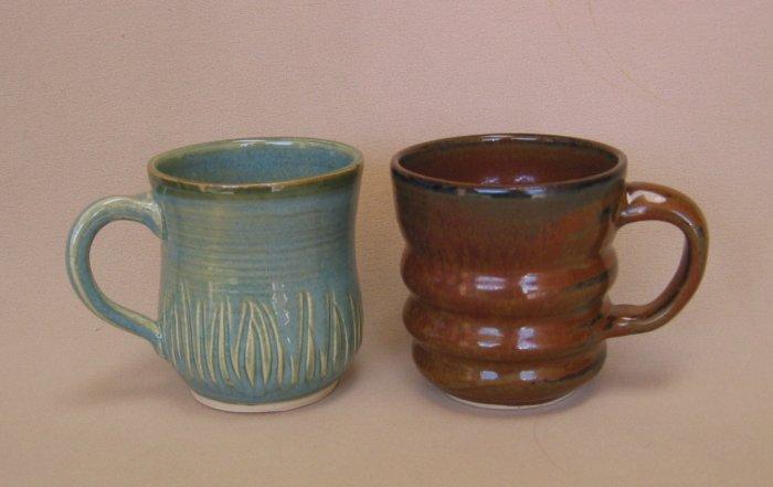
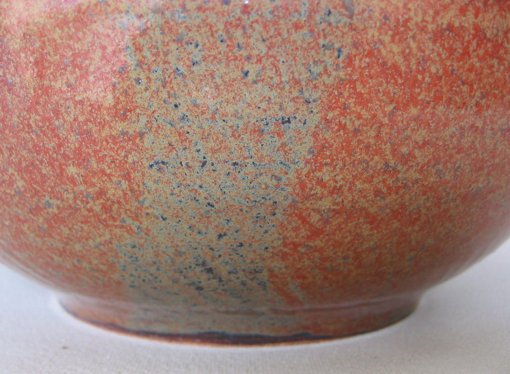
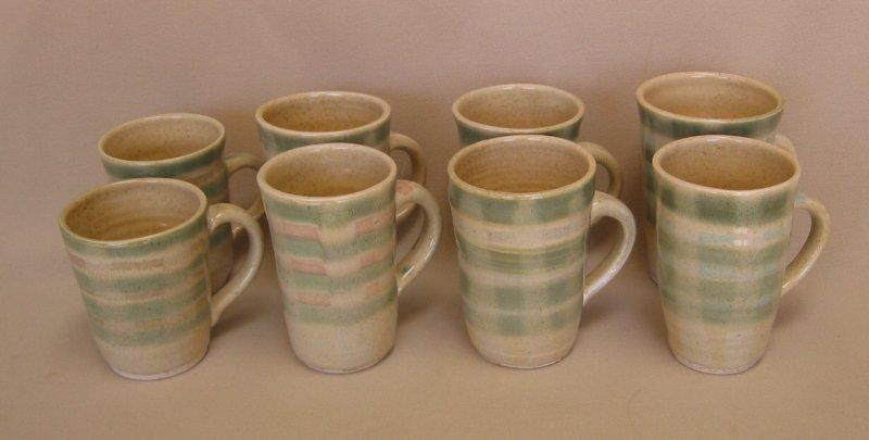
Mugs should feel "just right"... just right in the hand, and to our lips. Figuring out what features are desirable in a mug is what is making them interesting to me again; I see that just small variances in handle placement, rim angle, and width to height proportion can make a big difference...The other day I made 8 mugs, changing proportions slightly. When it came time to glaze them, I wanted them to work as a set if a buyer wanted more than one, so they all have vertical stripes of a rutile/titanium wash, and horizontal copper stripes, but I tried different Mason stain stripes in between the copper . From left to right, the pairs have stripes of 1-an iron mixture, 2-blackberry, 3-pink (burned out) 4-turquoise. Iwanted to have the rutile wash stripes cause the horizonal stripes to sag, but I need to use a heavier application next time.

And yes, of the eight, two or three are my favorites. They have a slightly thinned lip, exactly 3 and one-quarter inch top diameter, and the handle placement and shape give a feeling of balance. Actually they all feel pretty good, but the human hand can distinguish slight variations. If you've read this far, you must be a potter !

Tuesday, October 11, 2005


I want to post a few pictures from my Oct. 9 glaze firing (^7ox). In one of my earlier entries I was wailing about how my favorite iron red glaze was not coming out right. Well, it turns out this glaze likes a soak on the way down at about 1600 for several hours . I learned this from John Hesselberth on "Clayart". Another Clayart member, Tom Buck clarified some of the reasons for a "muck" olive color replacing the red ...overfiring most likely. Anyway, the top photo shows 3 pieces which I redipped and refired- they are much improved. The mug was not a refire, and shows a decent color too. (the turquoise mug is there to make the other one look redder, haha. I didn't know the handle on the red one was so "sturdy"!!- someone else must have sneaked into my studio and attached that one. Feels OK, though.

At the suggestion of Dannon Rhudy, I tested adding a little bone ash to this glaze and sure enough, a side by side test looks promising enough to try a larger amount next firing.
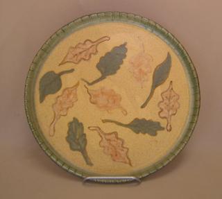
This is an 11" plate. As is the following one of gourds.
This next one is an 18" tray. It turned out to be somewhat of a "spinner". Well, hey, is that all bad? It's big enough for me to call it a lazy susan-done intentionally, of course!

Thursday, September 01, 2005


SCULPTURES- three of wood, and a stoneware fountain


"Faces" is the short name for this one. It is made of two mahogany planks. All pieces are moveable, making many combinations, or "relationships" possible. Another name for this piece is "Is it really you?". I used a sabre saw to cut the outlines, did lots of filing to round the edges, and lots of sanding, ending with 600 grit paper. It feels lovely.


Another piece I finished the end of October 2005 is called "Of Two Minds". I started with a 14" wide oak board (36" long) and cut out a profile of a man's face. I wanted to use a continuous line to show his cheekbone, eye area, and nose; this resulted in sort of a jarring area when I first sketched the design. However, it interested me enough to want to see it created, so I went ahead and made it. The panels are mounted on a cork background, but are floating above it by means of 3/4 inch spacers. The first picture shows it hung in the Grossman Gallery in Lompoc CA during a show in November 05. The second picture is the image I will use if I make prints or cards.
A few people have professed to like the piece, but I can tell most do not, or just find the contrast of positive and negative spaces interesting. Anyway, at least I picked a good title for it!


The mahogany sculpture below can be oriented any direction. I've usually hung it vertically. I'm always interested in the tension between positive and negative spaces. Size is about 42x24".


No, it's not a pile of rocks! A friend asked me to make a fountain for her, "something naturalistic". This is what I saw in my mind's eye; this piece actually turned out very much like I envisioned it. The "cliff" part is separate, and the tube for the pump goes up inside it, and water flows down the front. Did I say it it's all ceramic? ...even the little stones. To get rocky looking glazes, I added barnard clay to some brownish or greenish glazes, and quite a bit of alumina to be sure they weren't shiny. The 2 black boulders in front are shiny anyway, but the rest of them look about right. The thing is about 19 inches across, and yes, HEAVY. It is set up and working at my friends house. I should replace this photo with one showing the water.

Tuesday, August 30, 2005

Feeling uneasy the last few days...ever since Hurricane Katrina blew in and did so much damage on the Gulf Coast. At first, after dire warnings for New Orleans seemed overstated, newspeople were saying New Orleans managed to come off lucky again. Then the water began rising in the city, and stories of horrible conditions in surrounding areas began to be told. You hear of floating bodies being ignored because it's vital that rescue workers concentrate on finding people who are still alive but need help. I'm sure there are people all over with friends and family in the flooded areas that they haven't heard from, who are are having nightmares about their loved ones being dead, undiscovered and unattended. A lot of heartbreak yet to come.

Saturday, August 27, 2005

Here's a poem: I was really into painting in the summer of 1965, and wrote this while working on an abstract painting called "Sleep".

REFLECTIONS WHILE PAINTING

How can one express the inexpressible
or picture something without form;
define with lines the essense of elusiveness?

The art has not been born
where paint can show the shape desires take
nor colors indicate a glow of pleasure;

Perspective on a canvas does not reach
where my imagination stretches;

Pure white is not as light as thoughts that soar in air
nor ebony as dark as feelings plunged in black despair.

But lack of hues precisely true
has not kept man from trying all his life
to fathom mystery with a brush, and thus,
a mortal canvas often has been touched by immortality
and stained with pigments that the soul alone can see
as tones the artist felt, when by approximation,
he gave vent to inspiration;

Mere tints suggest and hint at ecstasy
and knowledge beyond pedantry.

Thursday, August 25, 2005

Copper Tubing Sculpture: Posting the wall sculpture photo just now reminded me of one of the hanging sculptures I made a while ago. It's about 14" each direction, and rotates slowly on our patio. It is fascinating to watch it's shape change as it moves. Here are three pictures of it:


This piece is called "Numbers". It's a 13" diam. wall sculpture, high fired stoneware with Touchtone Red glaze under the white additions. (that's a "1" at the top, BTW, not zero.

Sometimes you just have to go ahead and make something you've been clay-doodling with for a while! You can see it doesn't take much to entertain me- I like looking at shapes made with loops...

It will go into our local art association gallery next Monday and may provoke some conversation; it will be interesting to see if it sells...ok if it doesn't.

Wednesday, August 24, 2005


Rutile wash over high iron glaze This vase was glazed with what I am calling "Bad Touchtone" (the batch prior to the latest one) and I purposely gave it just a quick dip, and got a very deep brown/black. Just what I wanted, as a base for this rutile, titanium, and GB wash (recipe from Clayart) which generally adds life wherever you put it, and would, I knew from previous tests, do a sort of nutmeg almost crystal looking effect with slow cooling. The marks are made with a slice of hickory nut.


Touchtone Red Glaze, ^6 to 7, oxidation

I started using this glaze a few years ago (got it from Rebecca Varner in a Clayart mug exchange) and have loved it for the excitement it gave to opening the kiln. ..never quite sure what to expect. Where thinly applied it is often a deep navy color. There is often a varying amount of sort of an olive color and whoopee! look at all that red, lovely iron red. This vase, which I call "Red Dancer" has the kind of result I hope for from this glaze. It is of white stoneware.

When I ran out of this glaze a while ago, I mixed up a new
batch, and was very disappointed; there was a lot of the olive, but not a nice olive, some sort-of black, and some brownish red, or faintly reddish brown. I didn't even take any pictures- all the pieces were designated to be re-dipped and refired. I remembered that I had used some red iron oxide from a different source, and thought that might be the problem. I also checked my firing logs to make sure I didn't go hotter or cool down faster. That was all about the same.

So, last week I mixed a new batch (half recipe, actually) and fired over the weekend. The result: better, but different, sort of spotty- maybe I need to strain it a few more times.

You can see my liner glaze was fluid enough on the rim to carry down the stripe I did just under the rim. The stripe was half RIO, half rutile. Anyway there is some decent red here, as well as pale olive. I actually don't mind the blotchy look, at least on this piece. I took a macro of the area where the glaze is thinner- you can really see the color change. This bowl is a buff stoneware, by the way.


I swear there is no cobalt in this glaze. I rolled the bowl around in the glaze pan and didn't quite go all the way, so here's the area of thinner glaze.

The recipe is in the Clayart archives, I'm sure, but here it is anyway:

TOUCHTONE RED, cone 6/7, oxidation
15 minute soak, slowed cooling

Gerstley Borate 31
Flint 30
Feldspar 20 (I used Kingman)
Talc 14
EPK 5

Add Red Iron Oxide 15

Tuesday, August 02, 2005

Well, FINALLY, after a day of intermittently being frustrated trying to get the hang of getting my blog started, I changed templates and everything works! I've already deleted about 4 test messages, etc.

I managed to finish glazing a load of pots and will fire tomorrow.

Just getting started here...

Well, I succeeded in getting my picture uploaded to this post...let's see if anything will show up on the page now. Once this works, I can edit out these posts.